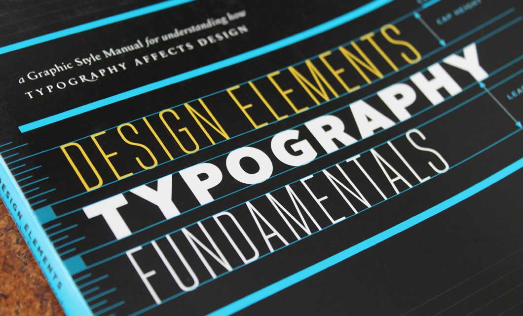
I’ve always been fond of the simplicity of the Logik word mark, and I am thrilled to have it included in the publication Design Elements: Typography Fundamentals.


“The Logik logotype conveys connections via a custom gi ligature, which also unites with the k. It is apt for a company that analyzes text documents and reveals links among them. The modified typeface is Century Schoolbook.”


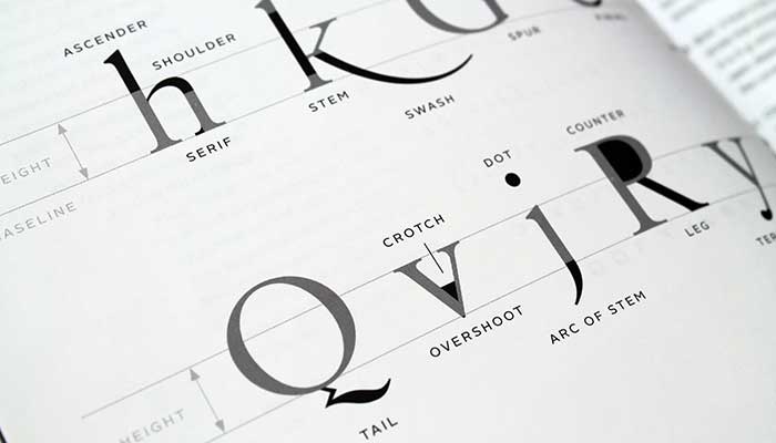
The book covers a variety of type related subjects including the anatomy of type, typesetting factors, grid systems, and ligatures. Comprised of informative text providing tips and techniques, visual examples, and lists of further reading, it’s an excellent resource for design students, and those interested in learning just what parts of type the chin, crotch, ear, and tail are.
Design Elements: Typography Fundamentals is published by Rockport and available on Amazon.
