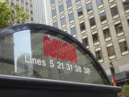
On a recent trip to San Francisco, the identity that connected most with me was the logo for Muni. It’s a great example of how standing by a well-designed logo rather than ‘keeping up with the times’ can sometimes provide a deep feeling of authenticity. The identity feels real, lived in and stylish to me—a reflection of San Francisco.
Via Wikipedia:
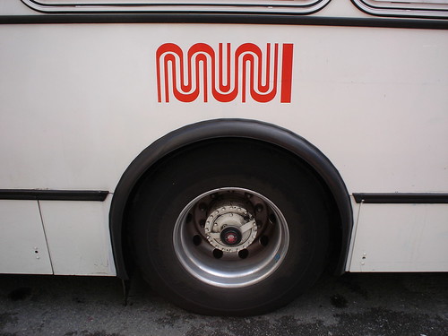
“Muni is short for the “Municipal” in “San Francisco Municipal Railway” and is not an acronym; thus, when it is written in plain text, only Muni (not MUNI) is correct. However, many San Franciscans, including some of those who work for Muni, write it MUNI. The Muni Metro is often called “the train” or “the streetcar”. Most SF Natives reference ‘Muni’ when speaking about the city trains and ‘bus’ for everything else. Muni’s logo is a stylized, trademarked “worm” version of the word “MUNI”. This logo was designed by San Francisco-based graphic designer Walter Landor in the mid-1970s.”
What Could Have Been
In 1997, The Examiner reported Controversial Muni logo heads for city panel review with a student designed identity. Kirsten Stewart, a student at the Academy of Art College, developed the proposed logo as part of a class project and would have been paid $5,000 had the Public Transportation Commission approved it. The proposed logo, apparently a winged circle with “MUNI” inside, thankfully did not replace the classic Walter Landor ‘worm’ identity. The reaction thirty years ago to the choice of not using professional designers, or paying professional fees is very similar to what we continue to hear today.
“As if the public wasn’t miffed enough that Muni was trying to blunt criticism of poor performance with a new paint job, designers around The City were angry that a student rendering got the nod.” Marsha Ginsburg, The Examiner
In contrast to the $5,000 the graphic design student was to be paid, the Landor designed Muni logo cost $100,000 to develop. Worth it I think. You?
A Few Interesting and Related Links:
169 International Metro Logos

Muni is one of 169 logos on the Metrobits.org website. They have an excellent collection of metro identities I discovered when writing this post.
Walter Landor on Design, Branding, and Landor
“In 1977 Walter Landor, founder of Landor Associates was interviewed by a journalist from KPIX (CBS) for the television show Evening Magazine. Sitting on the deck of the Klamath ferryboat (former headquarters of Landor Associates), with the San Francisco Bay in the background, Walter talks about the art of branding, working with clients, and even a little about himself. This historical video captures the magic of the man and provides a glimpse inside one of the most unusual office settings around.”