Confluence Architecture: Branding and logo design for architect
Services:
Logo design
Website
Business cards
Signage
Confluence Architecture (formerly Mercier Pfalzgraf Architectes) is a Gatineau-based firm providing a complete range of professional architecture services for both public and private sector clients in the National Capital Region (Quebec and Ontario). Confluence Architecture believes architecture has the power to transform lives and improve communities. They practice architecture with a rigorous and exacting methodology, incorporating cross-discipline research and digital technologies, and aspire to be open, inventive and committed.
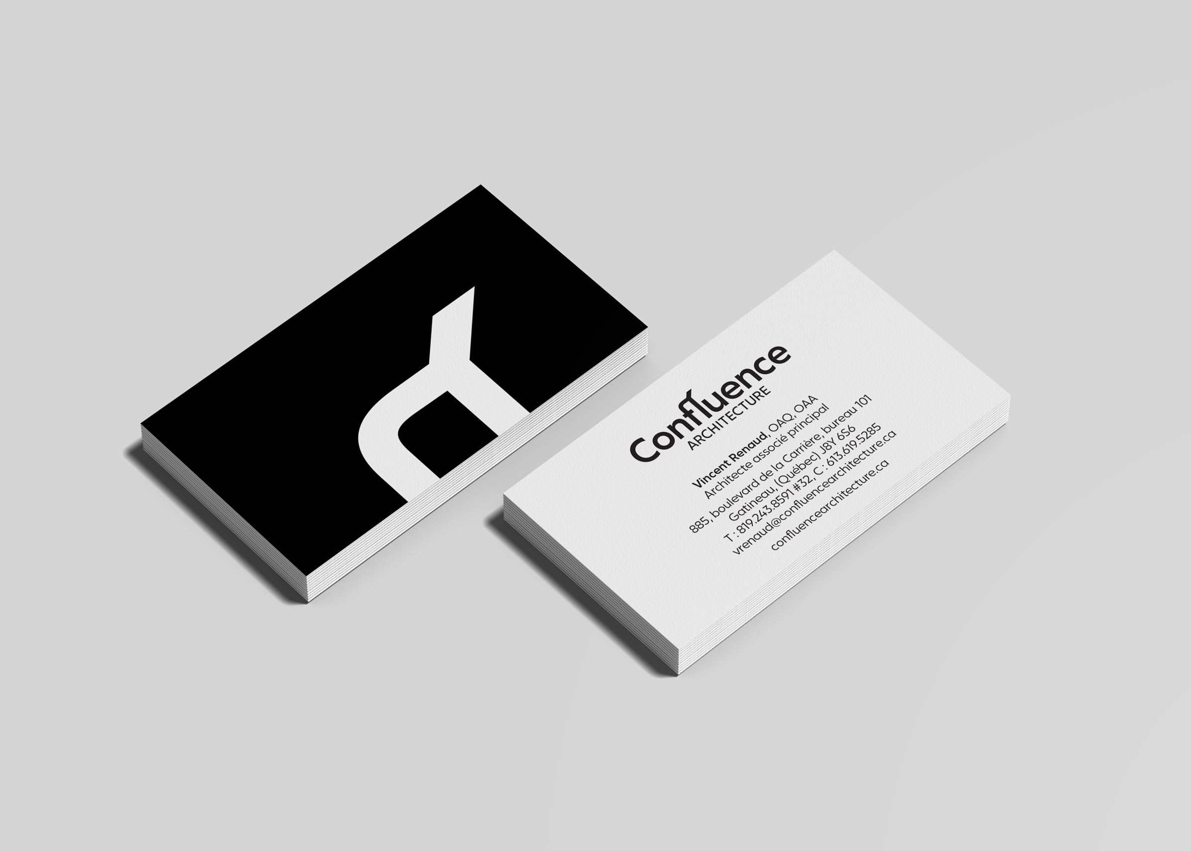
The branding for Confluence Architecture has an aesthetic that is timeless, bold, and minimal. We wanted to challenge some conventional thinking (suburban, conservative, and negative connotations) regarding the firm’s location in Gatineau. This bold and minimal wordmark reflects: the meeting of two rivers (confluence); multiple sources of needs/resources/skills coming together to transform, improve and move in a unified direction; and a bilingual offering—the line coming from the fl ligature subtly feels like an accent aigu as the firm operates in both English and French.

Confluence-Architecture-Website-03

Confluence-Architecture-Website-01

Confluence-Architecture-Website-04

Confluence-Architecture-Website-02
![]()
![]()
By cropping the ligature in the wordmark, a symbol is created, providing a secondary branding element.
This alternate concept presented to Confluence Architecture takes the meeting of two rivers to form an abstract maple leaf. The lines represent multiple needs/resources/skills coming together to transform, improve and move in a unified direction.
![]()